Breadth Indicators: How could you have anticipated the Market fall?
Use this as confirmation to the primary signal i.e. PRICE
So the markets (CNX 500) fell about -6% from the top last week and recovered 1.6% today. A fall of >5% a week is no joke and the question I asked myself at the end of the week was, “Could I have known about the fall beforehand?”. If not the magnitude, at least the occurrence of the fall?
Here is what I found:
(Number of 52-week highs - number of 52-week lows)*100/ (Number of 52-week highs + number of 52-week lows).
It is an oscillator with a range between 100 to -100.
Not surprisingly the highs and lows of the High-low index plot coincide with the Highs and lows of the market (CNX500).
Interestingly, the supporting trendline in CNX500 broke down convincingly on 21st December while the High-low broke down 2 days early on the 19th and was way below the trendline on the 21st.
Percentage of Stocks above their key moving averages 200DMA/50DMA:
This is another excellent metric that informs us about market conditions. The rule of thumb is that the greater the number healthier the market.
Not surprisingly again, the highs and lows of this plot coincide with the Highs and lows of the market (CNX500).
Interestingly, we could see a clear divergence in the tops. While the price made a Higher High, the PSA (percentage stocks above) 200DMA made a high equal to the previous high whereas the PSA 50DMA even worse made a lower high.
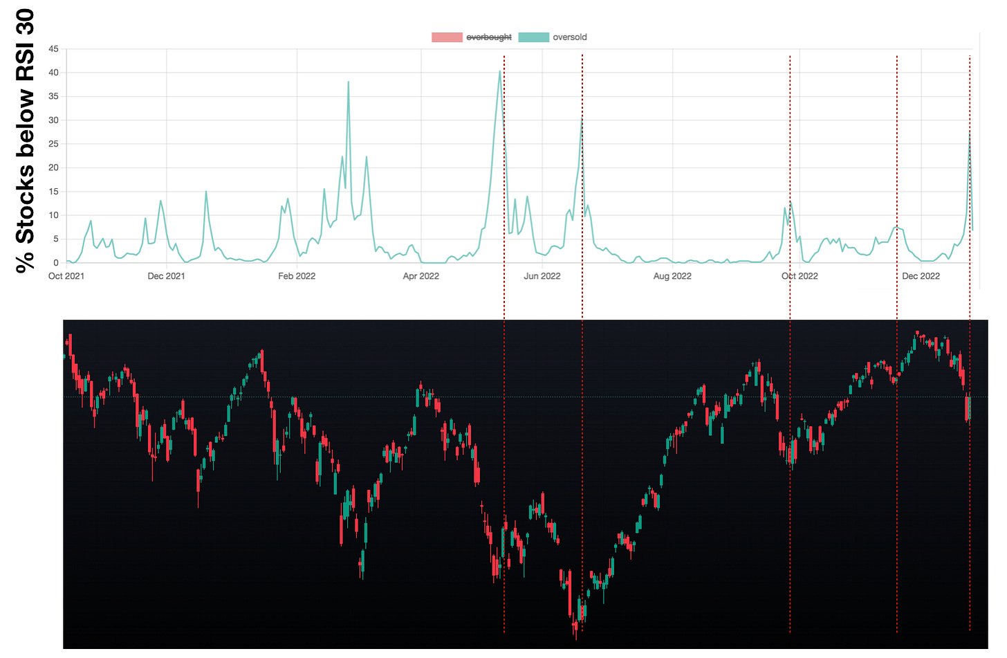
The RSI oversold Vs overbought indicator:
The percentage of stocks that are overbought (RSI more than 70) or oversold (RSI less than 30) gives you a sense of the market breadth. The market rarely stays overbought or oversold for too long and is bound to revert. Naturally, the market tops and bottoms coincide with overbought tops and oversold tops.
Divergences (just like the one we saw above in the case of PSA 200/50 DMA) between the price and the indicator in both tops and bottoms are valuable signs of an impending reversal in the market.
The overbought indicator tops showed a clear divergence with CNX 500 price tops.
Now, also notice that the oversold indicator generally tops at market bottoms and it topped last Friday and reversed with markets turning up today, signaling a potential near-term bottom.
The number of stocks making 52-week high close:
There was a sharp drop off in the number of stocks making a new 52-week high close on 19th December while the price was still at the trendline support. This was a clear leading indicator of the fall to come.
Also notice the number stayed at single-digit levels throughout the week and today reversed, again signaling a possible bottom
To recap:
The secondary breath indicators are beneficial in confirming the tops and bottoms of the markets.
Look for divergences and trendline breaks.
On a cautionary note, no single indicator should be used as a holy grail indicator, rather they need to be looked at in conjunction with other indicators.
And always remember, ONLY PRICE PAYS.
That’s all for today. I know it was more technical than usual, but I am hoping that this will nudge you toward looking at technical analysis more closely.
Cheers.
SH


great one!
Hi Prakash, I have although written the scanner for all the above criteria, I am finding it difficult to plot it on a graph and compare it with the Index chart. Any idea how? Thanks in advance.