Visualizing Relative Strength
All roads lead to ROME (Relative Strength)
“You don’t understand anything until you learn it more than one way.” — Marvin Minsky
As a beginner trader, FOMO is a real killer.
Every new indicator seems to be the ONE.
The relative strength (abbreviated as RS henceforth) indicators are no different.
I remember my initial beginner trading days jumping from 1 RS indicator to the next.
You know what I found at the end?
They are all the same technically. They will tell which stocks/indexes/charts have the highest/lowest relative strength.
It then becomes a matter of personal choice.
No 2 RS indicators will give you conflicting readings.
Nifty IT is currently leading the indices.
All RS indicators will show this FACT.
(let’s see if that is really the case in this article)
If they are not, then you have got a timeframe mismatch.
In this article, I will show you all possible ways of visualizing RS, from a simple line chart to a complex RRG chart.
All roads lead to ROME (RS).
Before you proceed further, please read this article to understand the basics of Relative Strength (link).
Here is an in-depth video explainer of this article (link).
Different ways to find Relative Strength:
Naked Chart or “Feels”:
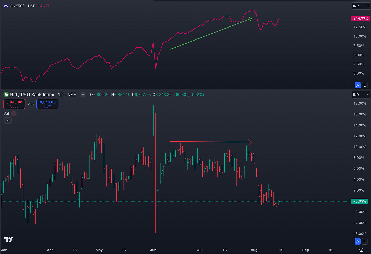
This is the simplest way. You don’t need anything else except the chart you are looking at. Eg. PSUBanks.
They were the weakest among all groups/indices. They did not bounce after the election results debacle. You wouldn’t need anything fancy to know that it had one of the poorest RS, would you?
On the other hand, pharma names (and the index) broke out of a big base and have been climbing higher since. So, “feels” does tell you about RS.
But it’s good to “quantitate” the “feels”. Why? Because feels ain’t Shakira’s hips and they can lie (sometimes).
Line charts:
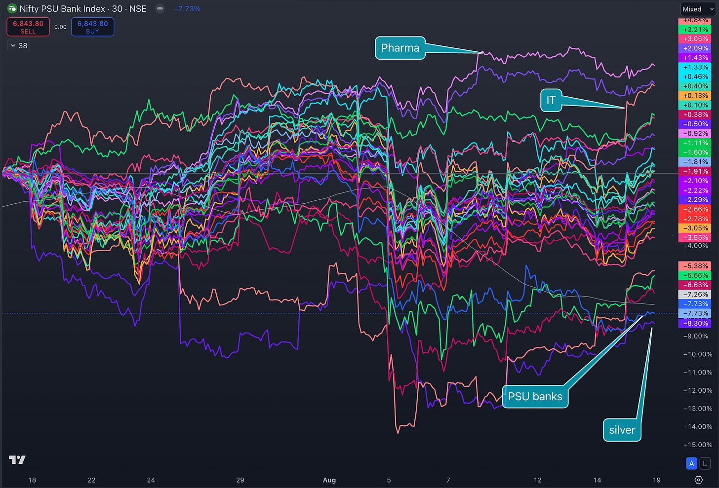
The next option is to look at your chart and the benchmark chart side by side. A line chart is preferred here as it gives a better (noise-less) visual representation.
One can also line up more than 2 charts.
The slope of the line gives you a measure of outperformance.
The higher the slope, the higher the performance and, the higher the relative strength.
Eg the last 30 days line charts of various indices show Pharma-Health & IT has outperformed on the top and PSU Banks and silver at the bottom (still carrying Silver, eh?).
Another common and simpler version of this technique is to have the chart of benchmark index on top of your chart and have a “feel” of the slope.
Ratio Charts:
Now we are getting into more complex ways to quantitate Relative Strength. Ratio charts.
These are nothing but a plot of the ratio of the price of your instrument: the price of your benchmark instrument. Simpaal
Here are 2 ratio plots:
Nifty IT/ Nifty500 (top)
Nifty PSUBanks/ Nifty500 (bottom)
The slope of the plots tells you a clear story.
MARS and Other Relative Strength Indicators:
Your standard Relative Strength indicator you see on Tradingview.
These are nothing but a form of ratio chart.
The percentage change of your instrument’s price (Nifty PSUBanks in the example below) is divided by the percentage change of your benchmark’s (N500).
MARS is slightly different in that instead of the ratio of percentage change in price, it plots the ratio of the distance of price from a Moving Average.
But the end result is the same.
Which is?
It quantifies the Relative Strength of your instrument.
The example below shows the Relative underperformance of the PSUBank index. To compare, I have plotted 3 different RS indicators: TraderLion’s, Bharat Trader’s, and my favorite Nitin’s MARS. All 3 give you the same plot (given the same time frame and MA used, of course) but MARS is the most beautiful. (Lol! I am Biased macha!)
RRG charts: Relative Rotation Graph
The new kid in the block.
It’s a different way of visualizing the Relative Strength.
It is a dot plot with momentum (rate of change of price) on the X-axis and the ratio of price in the Y-axis.
You collect these dot plots over a time period and make a continuous plot out of it. This gives you the quantification and visual representation of how the RS has been changing over that time period.
The dot plot of your benchmark will be constant. With that as the center, when you plot your instrument, depending on its relative strength, the plot will fall into 1 of 4 Quadrants, the Upper Left being the Outperforming (Leading) quadrant, the lower right being the underperforming (Lagging) Quadrant
Instead of the linear representation of your RS charts on Tradingview, RRG gives you a rotational representation.
The end result is exactly the same.
Which is?
It quantifies the Relative Strength of your instrument.
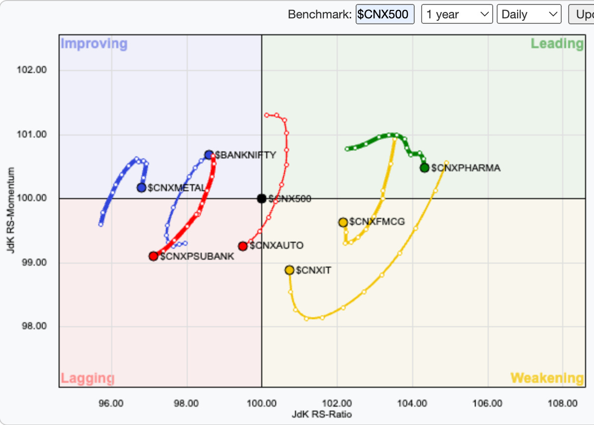
Shown below is an RRG graph comparing select indices for the last 10 days.
Its shows:
Pharma outperforming and has been in the last 10 days.
FMCG and IT which were outperforming 10 days ago, had their RS decreased but are now getting stronger (pointing upwards).
PSUbanks underperforming and has been in the last 7 days.
That brings me to the end of the article.
If you want to watch an in-depth video explainer of this article on Relative Strength, click (Here).
Lastly, which one should you use?
Just choose the one that you prefer the most.
Now that you know that all of them gives you the same information, as long as you know how to infer the charts correctly, anything should be fine.
Lastly, If you are a beginner trader, I understand the feeling of FOMO and excitement when you discover new tools and concepts (the same concepts with different names). Oftentimes, this FOMO can become a deterrent.
The solution is to develop a complete and fundamental understanding of price and technical analysis.
I help beginners do this in 2 ways:
1. Trading Systems Masterclass for beginners
2. Homma Private Access.
Details below:
Homma Private Access membership:
HPA is a subscription-based educational service (on WhatsApp). Benefits include:
Daily Market Breadth, Momentum, Sector Rotation, and Relative Strength Update.
Access to all my scanners including the BBB (buy before breakouts) scanner, and the Homma Khela Hobe 2.0 scanner.
Access to my proprietary Breadth-Momentum-Relative Strength & Sector Rotation dashboards.
Access to my Trading view indicators: Homma Khela Hobe, Buy before Breakouts (BBB), Homma Endgame, etc.
Access to live Telegram alerts to Homma Khela Hobe, Homma Pullback, and TGP scanners.
HPA Weekly: Hourly weekend deep dives and Q&A.
1-year access to The Technical Take premium.
Live alerts to high-risk-reward setups breaking out.
Live updates on my portfolio and the trading setup rationale.
Access to my high probability watchlist.
Yearly membership of 15000/- INR only.
UPI payment & WhatsApp @ 9481506784.
Yours
Sakatas “Quantify the RS” Homma.
Socials and Homma community:


