Top 10 Topping Signals in a Stage-3 stock
and other subtle signs that the stock is undergoing distribution. Central Dogma of a trade 5.1
In this article I will discuss the top 10 signals of a Stage 3 stock:
3 Key Topping/reversal chart patterns.
Break of a Longterm Ascending Channel or Moving Average.
Characteristic price-volume action inside a stage 3 base.
Bearish candlesticks signaling a potential TOP.
Highest volume in a year (HVY) as a high-fidelity topping indicator.
Exhaustion Gaps.
Negative Price-Volume divergence.
Bearish divergences on other indicators.
Price stagnant/fall on excellent results.
Absurd Valuations.
Alright. This is a huge topic and each of the 10 signal listed above demands a separate article of its own. Most of the topping discussions will be with respect to a larger timeframe (weekly sounds good) and in line with Weinstein’s stage 3 distribution tops.
Lessssss Gooooo….
3 Key Topping chart patterns:
There are 3 chart patterns that frequently occur as Stage 3 Tops. All of them are bonafide reversal patterns (except the 3rd one, which could break out and morph into a part of a more extensive base, unless broken down) I list them in order of their fidelity and effectiveness:
The Head & Shoulders Top.
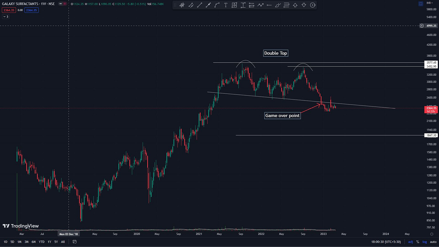
The Double Top.
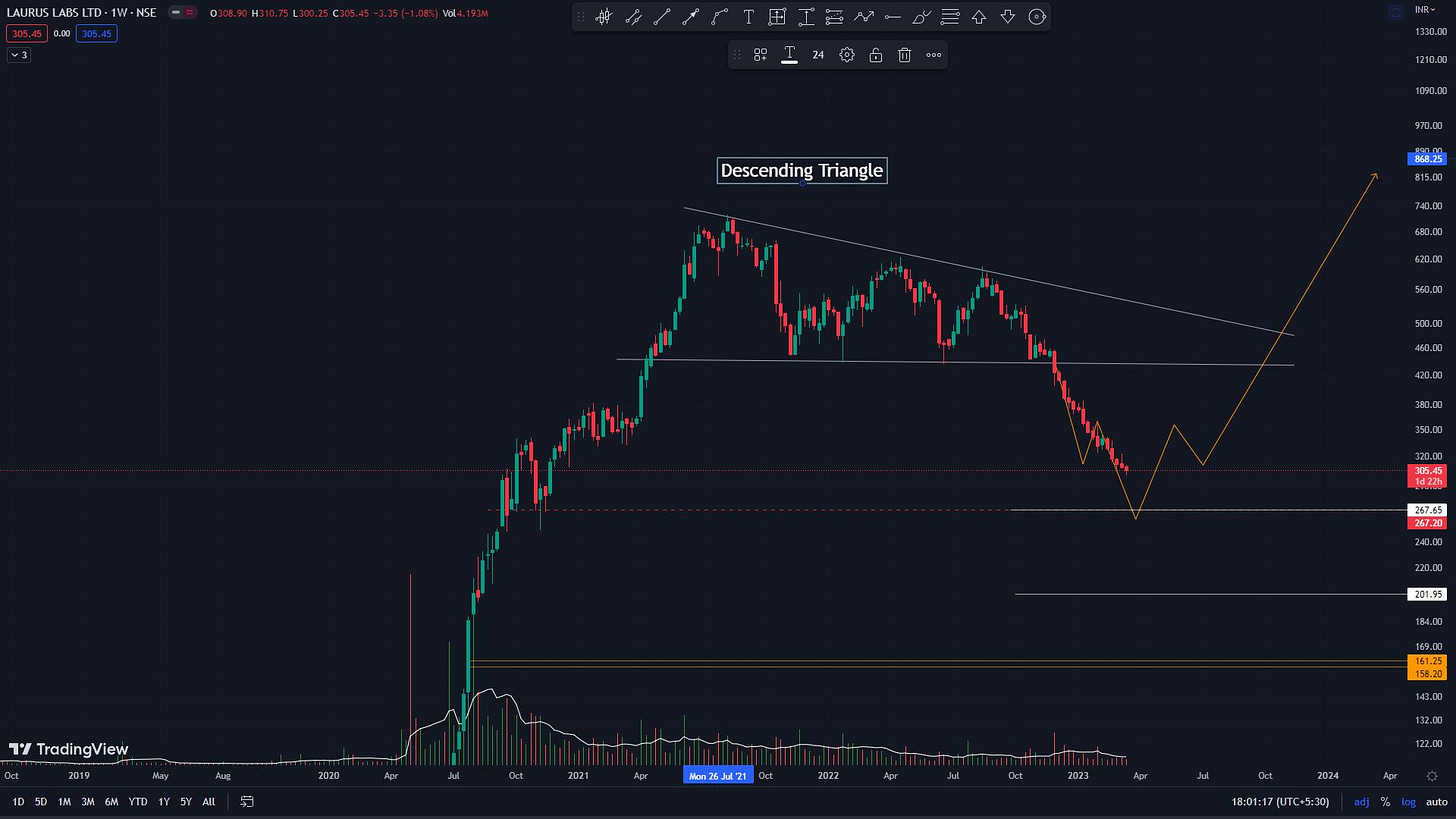
The Descending Triangle.
I will dig deep into each pattern separately (some other article) but all 3 patterns once broken down, bring about 1 and only 1 key outcome i.e reversal of the prevailing uptrend. This is clear as the breakdown point is the breakdown from a prior swing low (higher low) to form a lower low which signals the beginning of a downtrend. This is shown in the diagram and examples below.
Head & Shoulder in Quess Corp
Double Top in Galaxy Surfactants:
Descending Triangle in Laurus labs:
Break of a Longterm Ascending Channel or Moving average:
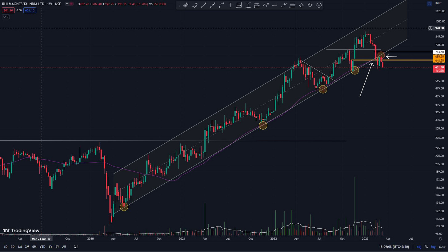
Anything above 9 months can be considered long enough for stage 2 to play out. The break of a long-term Ascending channel or an uptrending support can be one of the earliest signs of an end of stage 2 and the beginning of stage 3. Sometimes, when the channel is wider (more than 20%), it can also spell the end of stage 3 rather than the beginning, as the distribution might have already played out inside the wide channel swings.
Similarly, the break of a key moving average which the stock has been respecting for a long time is a massive indication that the stock is losing momentum and a change of trend is imminent.
Examples:
Ascending Channel and long-term Moving Average (50 and 200 DMA) breakdown in RHIM and Relaxo
Characteristic price-volume action inside a stage 3 base:
The 4 stages have distinct price volume characteristics: Some of the peculiar characteristics inside the stage 3 base are as follows:
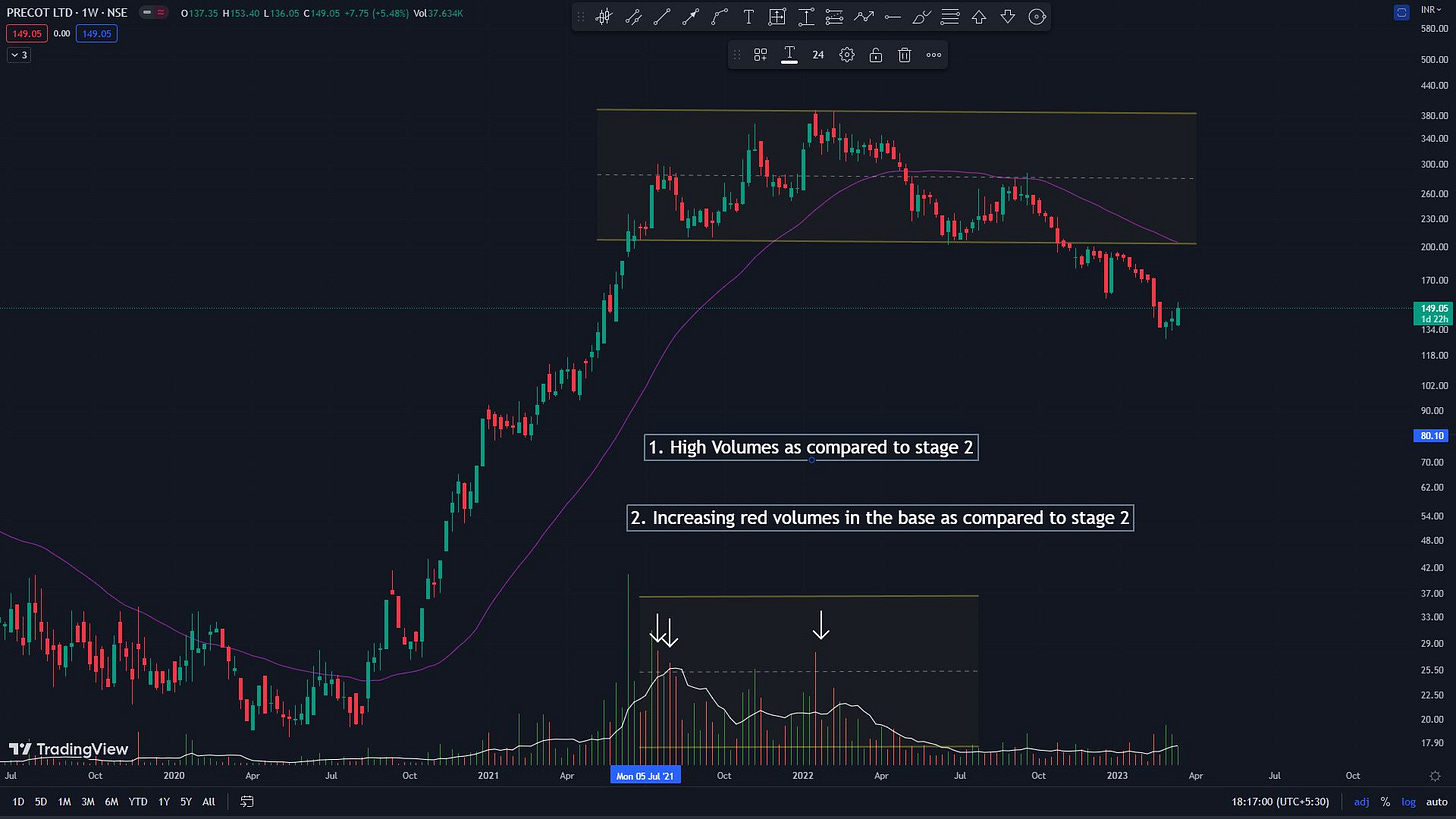
High average volume with little or no price movement.
Increasing red volumes in the base as compared to stage 2.
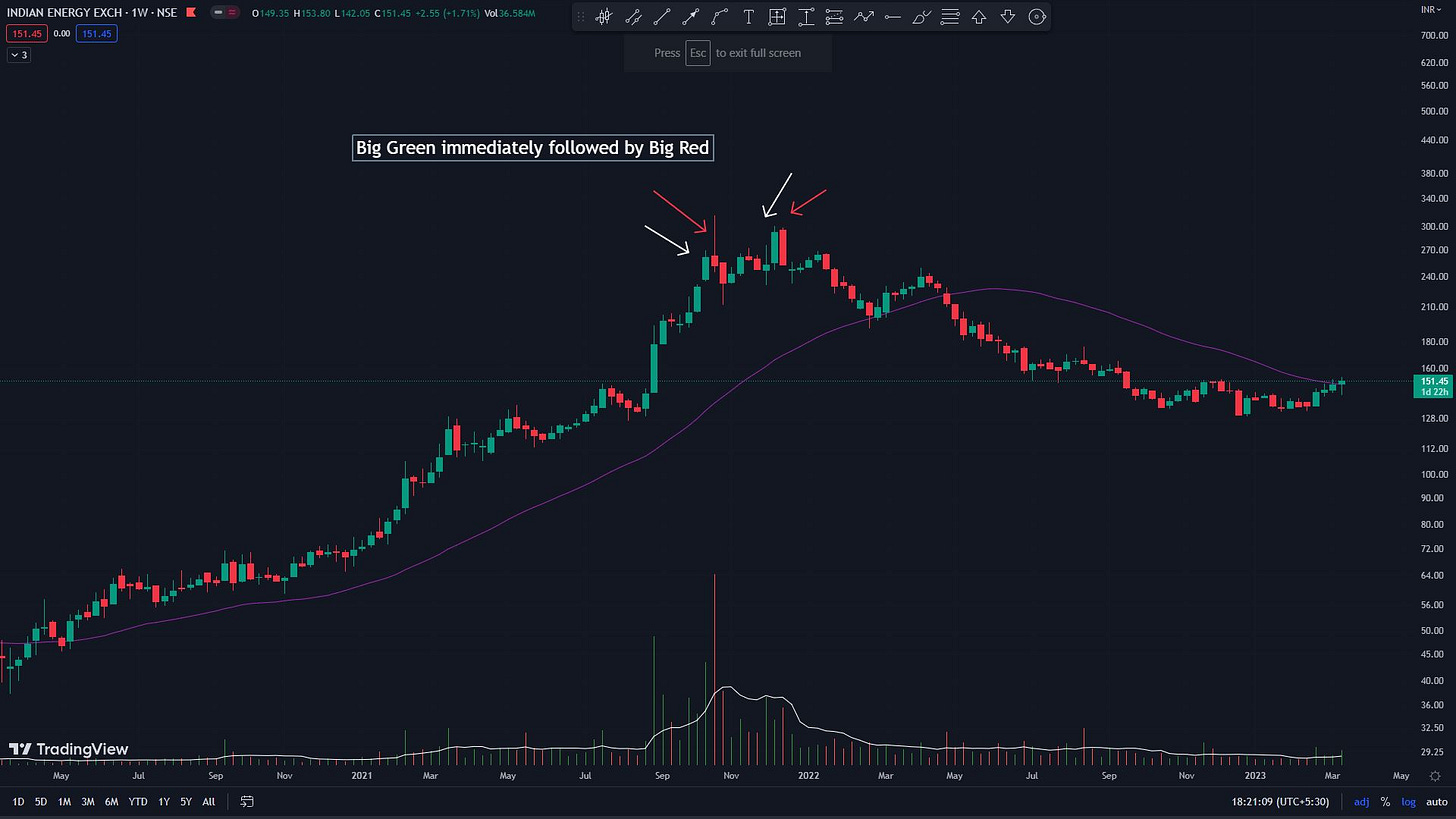
Green price candles immediately followed by red candles.
High-volume candles with negligible price moves or negative price moves.
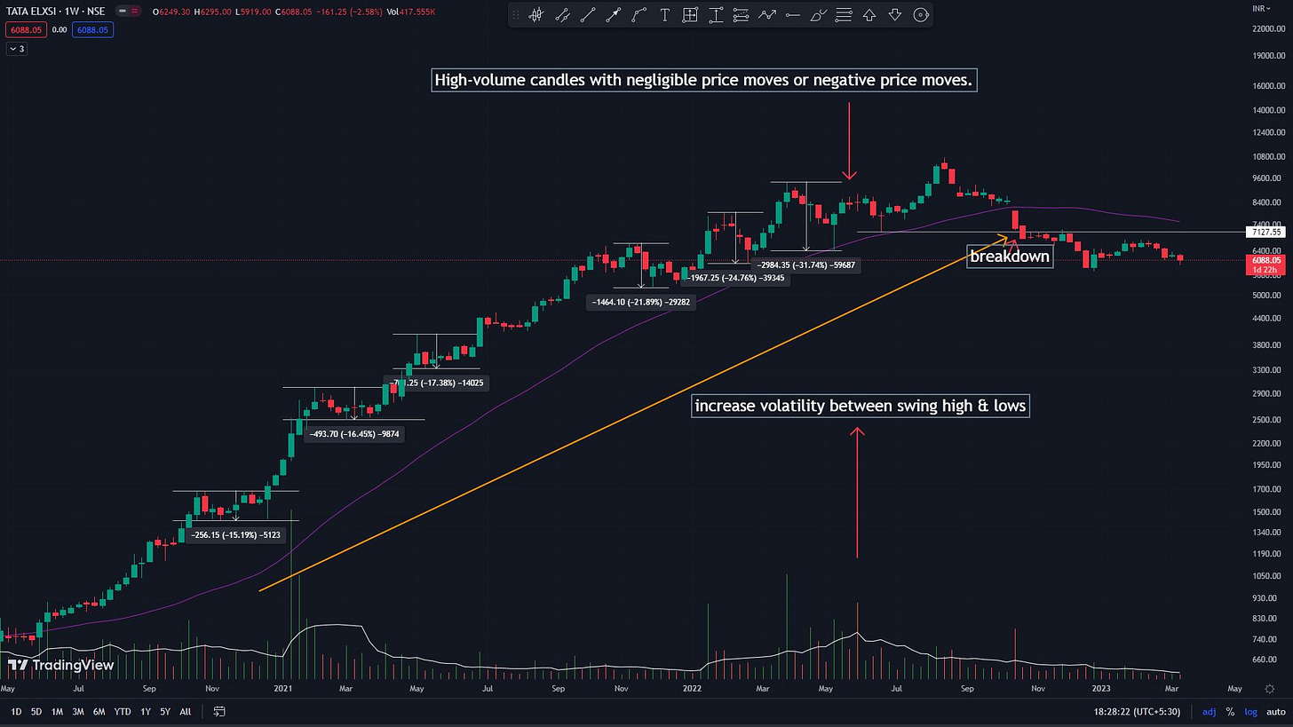
Widening Volatility between price swing highs and swing lows.
Below are some examples where all 5 characteristics are shown in the chart.
Precot: See High volumes during the stage 3 base.
IEX: Green candles immediately followed by Big red candles
IEX: High-volume candles with negligible price moves or negative price moves.
Tata Elxsi: Widening Volatility between price swing highs and swing lows as it approaches stage 3 Top.
Bearish candlesticks signaling a potential TOP:
Candlesticks are potent indicators of immediate sentiment. As such, bearish candlestick pile up during a stage 3 base at the tops. Some of the notorious ones that make frequent appearances are as follows:
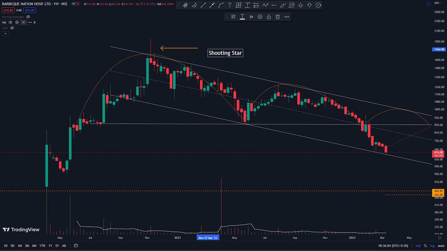
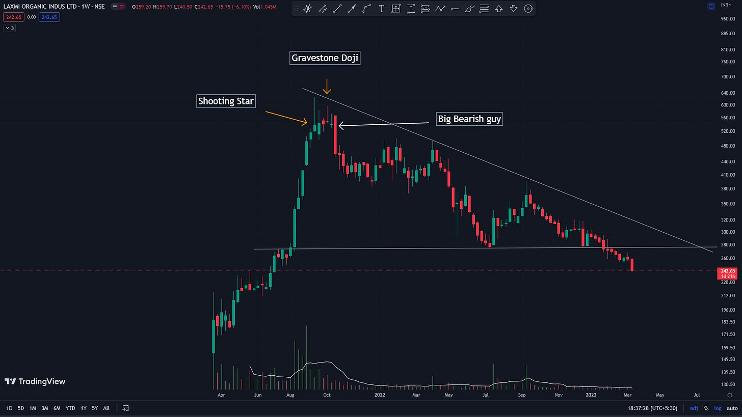
Shooting star/ Gravestone Doji:
These dojis (Dojis are small-bodied candles, with long wicks) have a long upper wick and a very short to non-existent lower wick. They show extreme supply at the top. These are especially dangerous if they accompany high volumes. Even more dangerous if they occur after a big green candle (with or without high volumes).
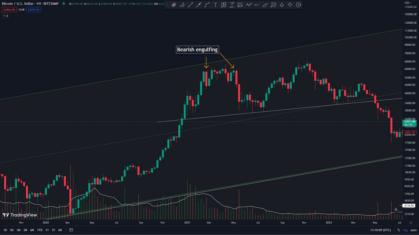
Bearish engulfing pattern:
A large red candle at the end of an uptrend, fully engulfing a big green candle. Pair this with high volumes, it spells peak distribution.
A big bearish Red candle:
This might sound lame, but the 1st huge red candle, daily or weekly after a prolonged uptrend filled with overtly green bullish candles, can be a sign of the start of distribution. Any breakdown of the price below the low of such a candle is a strong bearish signal.
Examples:
Shooting Star in Barbeque Nation
Gravestone doji in laxmi chemicals
Bearish engulfing in Bitcoin
Highest volume in a year (HVY) volume candle as a high-fidelity topping indicator:
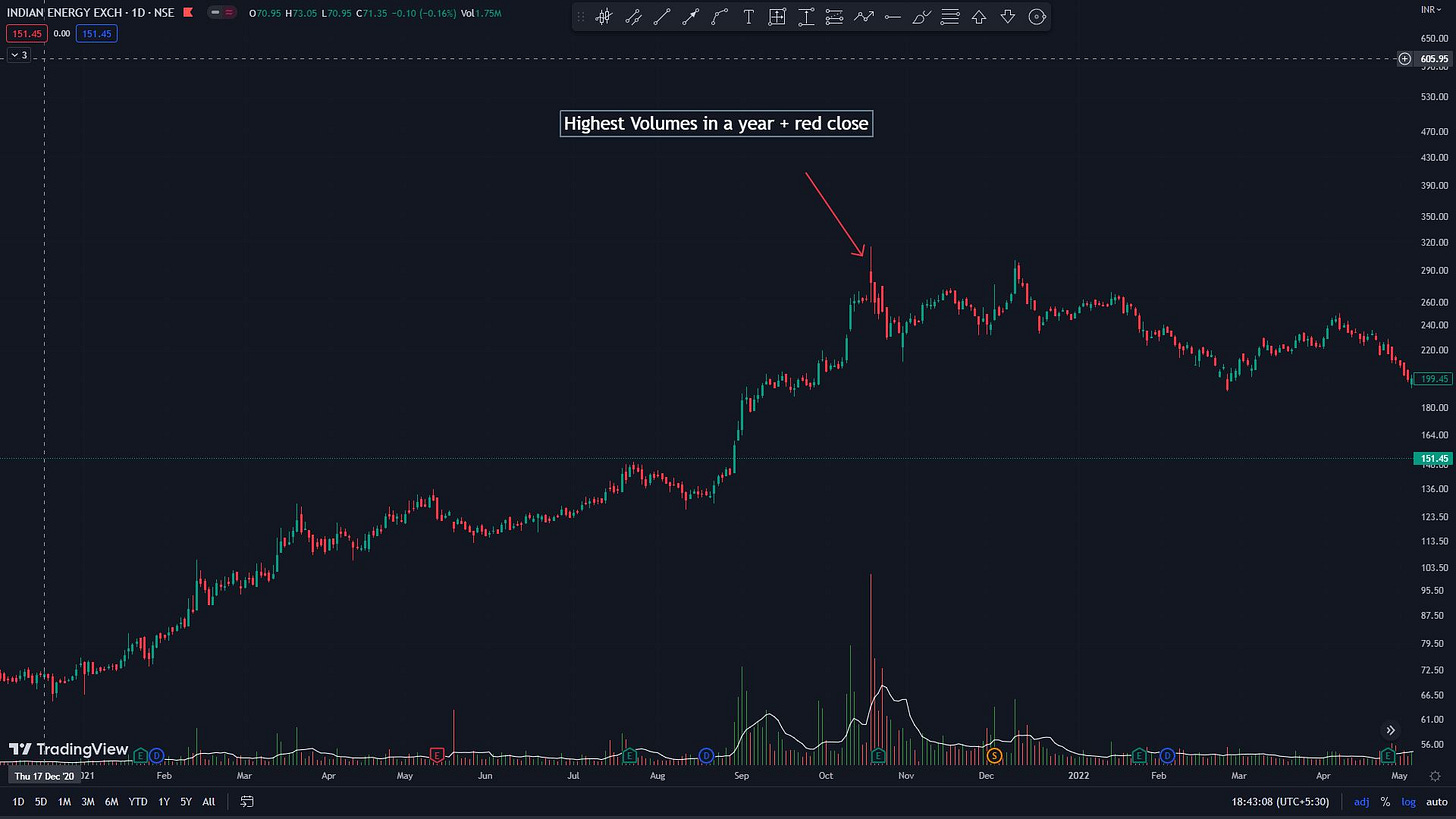
High Volumes mean high interest in the stock (mainly by the institutions). There are 2 phases when there is a high interest in a given stock: Stage 1 Accumulation & Stage 3 distribution. Now how do you separate an accumulation volume from a distribution volume? Simple, by looking at the PRICE. A green big price candle means accumulation, similarly, a big red price candle means distribution. Anything which deviates from the above description will signal something fishy.
Hence, an HVY volume candle WITHOUT a big GREEN price candle is a peak distribution signal. This could be shown in price as a small green candle, a small red candle, a shooting star/ gravestone doji, or an outright big red candle.
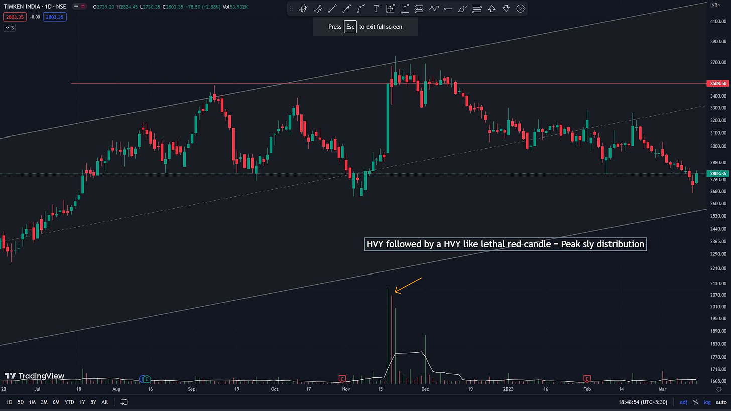
An HVY green candle followed by a similar volume Red candle is also equally lethal.
Examples:
HVY in IEX
HVY followed by a bearish candle with a similar volume in Timken
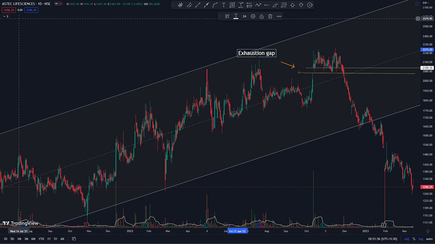
Exhaustion Gaps.
These are gaps that occur at the late stages of a trend 2 uptrend. Institutions often create them only to distribute their holding to retail. This kind of gap generally means the peak of the distribution phase. Although the stock may trend up further post this gap, it does eventually face heavy distribution, and shortly after, the trend reverses.
Distinguishing an exhaustion gap from a runaway gap is a higher-level skill. An exhaustion gap will generally be followed by all the signs discussed above viz: topping candlestick patterns like the shooting stars, and HVY distribution candles.
They will occur about 9-12 months after the stage 2 uptrend has already played out.
The volatility (% between the swing highs and swing lows) will be higher than during those prior 9-12 months of the uptrend.
Examples:
Natco pharma and Astec with Exhaustion gaps
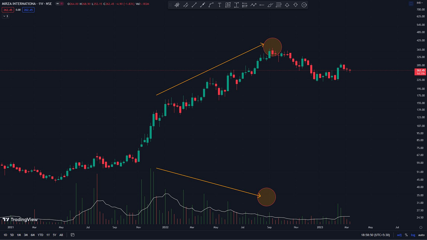
Negative Price-Volume divergence:
These are one of my favorite Topping signals. I want to caution you here that like most signals in TA, these also do not have a 100% probability and have to be weighted in concert with other topping signals discussed here.
A negative divergence occurs when the PRICE makes a swing high which is not accompanied by equally higher volumes, worse if it does not have any volumes.
These volume-less highs can sometimes be followed by a subsequent high, lacking volume support; which is an even stronger topping signal.
Eventually, prices topple down failing to make new highs.
Example:
Tata Elxsi and Mirza
Bearish divergences on other indicators.
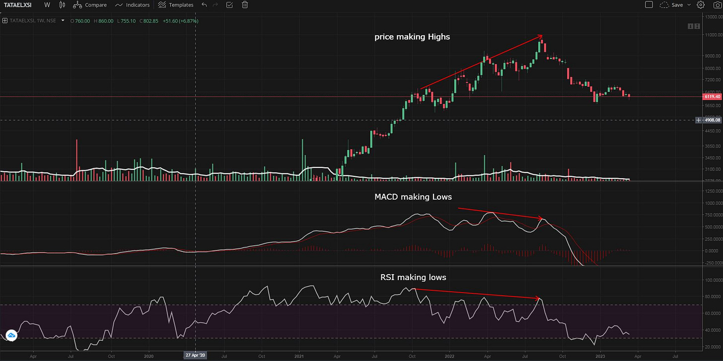
There can be seen similar bearish divergences of the price highs with the highs of other price-derived indicators such as MACD and RSI or the Relative strength indicator.
A Higher Price high with a lower high on MACD or RSI is a bearish divergence.
A lower price high with a higher high on MACD/RSI is also a bearish divergence (they call it a hidden bearish divergence; but who cares?). The lower price high is already showing weakness.
Example: Tata Elxsi showing bearish divergence on MACD, RSI, and the Relative strength indicator
Price stagnant/falls on excellent results:
As a pure TA-based trader I seldom track earnings, but how prices react to earnings can be a leading indicator of what’s to come.
If the price does not move up (or worse if it moves down) on good earnings (good earnings is a subjective term, but anything which is above market expectations), there is a high probability that the results are factored in the price already and that the stock in under stage-3 distribution by big players.
example:
Mahseamless
Absurd Valuations.
There is always a lead-lag relation between price and value. During stage 1 price lags value while during the top of stage 3, valuation lags price. Mean Reversion therefore occurs and price falls to their valuations (and beyond). And the cycle repeats (everything is cyclical guys, everything).
On this note, here is a thread I wrote about cyclicality and stage analysis:

Now,
This process can also be seen via a historical valuation-time plot (which valuation metic to pick is outside the scope of my expertise).
Whenever the valuation reaches the upper extreme, it could signal an incoming price Top.
Examples: All Adani stocks come under this.
Even Tata Elxsi, DMART, and IEX reached obscene valuations at the top of their cycles.
ATGL reached PE >800 before the epic fall; still above the median PE
Tata Elxsi
IEX reached a PE of >100 at the peak
Thats All for the weekend,
If you made it to the end, give yourself a pat on your back.
Your commitment to learning Technical Analysis will bear fruit sooner than later.
I will see you soon.
~Prakash
Last weekend’s Article on How to trade Gaps like a PRO?








Very informative blog.. You're an amazing blogger sakatas got to know about you from an random website financesha. Keep it up.