"Its better to be late to a party that is happening than to be early to one that has been canceled" ~ Homma
As a trader, knowing when to be invested and when to go fishing is paramount.
Knowing the degree of stock participation in the market rally is very important. Why?
The indices seldom paint a complete picture. Often Nifty50 keeps rising while bearishness already develops in the broader market. The opposite also happens.
Nifty50 and related indices remain sideways while many stocks already begin their moves.
Therefore,
to accurately measure the strength in the market, one needs to look at other data (indicators) on top of the indices.
I discussed one such indicator 2 weeks back, the High-Low index.
Today, I will tell you about another peak Breadth indicator, the Advance-Decline line (AD line).
TLDR:
What is the AD line?
AD line in different timeframes.
How to use the AD line to confirm the change in the market regime?
What is the AD line?
An advance-Decline line is a plot of the difference between
A = The number of advancing stocks i.e. the number of stocks that closed above the previous day's close; and
D = the number of declining stocks i.e. the number of stocks that closed below the previous day’s close.
within a stock universe.
The stock universe can be Nifty50, CNX500, the whole NSE universe, and so on.
Personally, I prefer to plot the AD line for the whole NSE universe (minus stocks below 100 cr Mcap - Stocks below 20 INR). Why? Because that is my fishing universe. For you, it might be different.
E.g., if you are a trader who only trades stocks in F&O, then you will be better off looking at the AD line of only F&O stocks.
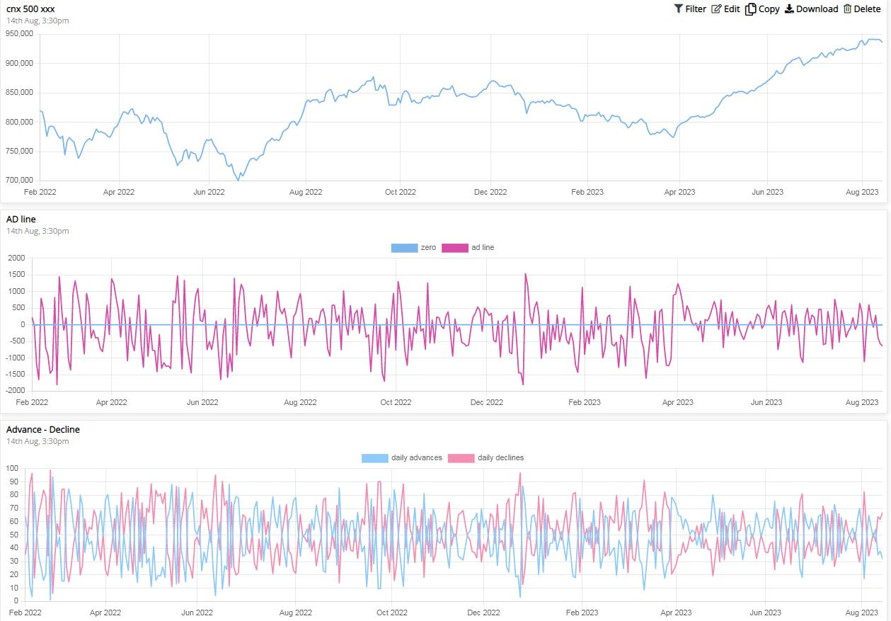
Shown below is the daily AD line along with the CNX500 plot on top and advance and declines as percentages for the NSE universe:
The Naked AD line is NOISY AF:
As you can see from the above plot it is pretty useless.
For the AD line to be useful in informing us about the breadth we have to change the plot slightly. Instead of plotting advances and declines a day ago plotting this for a longer time period gives us far more valuable information.
i.e. A20-D20, where
A20 = The number of stocks that closed above the 20 days ago close.
D20 = The number of stocks that closed below the 20 days ago close.
Let’s see what this plot looks like:
AD line in different timeframes:
Similarly, you can change the timeframe of the Advance and Declines to suit the timeframe you want to see (similar to using different moving averages to gauge the trend in the short-term and long-term).
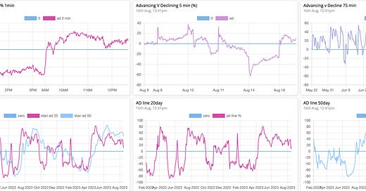
Below is a collage of AD lines for different timeframes, viz.
1-minute, 5-minutes, 75-minute, 20-day & 50-day.
Before trying to understand the current market breadth using the plots below, let’s look at how you can interpret the AD line in general.
How to use the AD line to confirm the changes in the market regime?
On any timeframe:
A positive AD line means a bullish or sideways market.
A positive value >20 means comfortably bullish.
A negative AD line means a bearish or sideways market.
A negative value < -20 means comfortably bearish.
A higher high and higher low means rising momentum and strength
A lower high and lower low means rising weakness.
Extreme values of +100 and -100 can mean a possible bottom formation.
A sharp transition from highly negative to highly positive value means a Bearish to bullish transition in the market.
A sharp transition from highly positive to highly negative value means a bullish to bearish transition in the market.
Now, let’s analyze the above plots to see what it means about the breadth of the market:
On a higher Timeframe i.e. 50 days, markets are still Bullish.
On a medium-term timeframe i.e. 20 days, markets are at a cliffhanger. The AD line is still positive but nearing negative territory.
On intraday timeframes, we are clearly on a downtrend as seen from the lower high and lower low formation of the AD lines in 5 and 75-minute plots.
Any resumption of the bullish trend will 1st show up in the intraday AD lines. They will cross to positive territory and then make HH-HL structures. The higher-term AD line will follow up similarly.
If Bearishness persists and the market breaks down, the 20-day AD line will turn negative, and the 50-day AD line will follow suit.
Trading is a process, it starts with knowing when to trade and when to sit out. Moreover, that timeframe needs to align with the timeframe your personality is the most comfortable with.
It’s a 2-fold process of learning and discovery. It takes time
If you want to accelerate this process. And,
cut short the first 2 years of pain, losses, and frustration in the market. I have the most in-depth live course for you starting on the 1st of September 2023.
The Sakatas Homma Technical Analysis Masterclass for Beginners:
Register here: https://t.co/WX0zjWhM0p
Full course content details: https://t.co/jxt5qXyBEm
Watch the 1st session of the last masterclass: https://t.co/tVZMPx719e
Read below what previous Masterclass members had to say about the course (this one will be even better):
https://t.co/ScmJTKJSec
https://twitter.com/SakatasHomma/status/1652722398750457856?s=20
(Early Bird/ Freedom offer: 2000/- INR off on 9999/- INR)
Once you make the payment, you get a referral code. Refer your friends and get another 2000/- INR off on each referral.
Payment: UPI @ lamaprakash41190@okaxis or 9481506784. Please send a screenshot of the payment via WhatsApp to the same number.
Lastly Please spread the word around by retweeting this tweet:
https://twitter.com/SakatasHomma/status/1688988798204706816?s=20
That is all from my side this weekend.
Don’t stop the grind and keep them stupid questions coming.
~Homma
Additional Information:
A more elaborate indicator also derived from Advance-Decline data is known as the McClellan Oscillator named after the people who derived it, Sherman and Marian McClellan.
You can read more about the McClellan Oscillator here https://www.investopedia.com/terms/m/mcclellanoscillator.asp


